

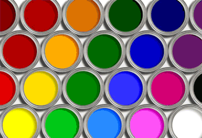
Choosing
the right interior color paint is a must for modern families. Colors like red,
pink, orange, brown, yellow, green, blue, gray, white and black can be used
effectively with the right combination. Check out in the following what painting contractors in Chicago have to say about choosing the right colors for the
interiors.
Choosing
the correct blend of colors for your interiors is a chance for you to showcase
your creativity. If you have a decent CCQ (Color Confidence Quotient) then we
would suggest you go through these points to take more inspiration for painting
rooms at home.
1. Red
Red
is frequently used as an accent color. But you can make your own norms and use
it effectively on your walls. But remember, saturated red gives a very intricate
effect, instead go for brown-reds to make things cozier.
2. Pink
Soft
shades of pink can give your ceilings a comfortable feel. If you’re confident
enough, try pink floors, but only on selected places. For some drama, go for
vibrant pastel shades of pink.
3. Orange
Orange
is another lively color, which is mostly used as an accent color and can be
used successfully as a predominant one. Peach shades of orange bring warmth. If
used on ceilings, it gives an energetic feel.
4. Brown
Light
browns can easily be used in the living area for a warm environment. For floors,
brown is a good option for strength and consistency. Soft hues are perfect for
creating a neutral background for furnishings.
5. Yellow
If
your room is not properly illuminated, yellow is the rescue because it’s
brighter than white. For a reflective effect on your ceilings, you can use
light shades of yellow. For walls, go for a golden shade.
6. Green
In
your study you can easily use green, since it brings a soothing effect which
will help you to concentrate. For the walls, yellowish green adds warmth,
whereas the bluish tinge brings freshness.
7. Blue
Blue
has to be used very carefully, since it usually has a cold and drab effect once
it’s applied over large areas. Soft shades of blue will be apt in the ceiling
if you prefer a cool and heavenly look.
8. Gray
Gray
is an elixir to creative minds. It is radically opposite to orange and gives a
fashionable touch to your background. For the floors, use a neutral shade and
make it look classy.
9. White
It
is the safest and the most sophisticated. However, in certain climates an
all-white interior might not work too well. White ceilings brighten up the
whole space by reflecting light and thus making the room look spacious.
10. Black
Black
is not a predominant color. Use it as an accent in housing or business
interiors. For open ceilings, black is a wonderful choice to make things look
visible.


0 comments:
Post a Comment